The Face Magazine "Design is more than a few tricks to the eye. It's a few tricks to the brain."
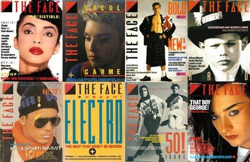
“The Face” was a British music, fashion and culture monthly magazine started in May 1980 by Nick Logan. It may have only been in circulation from 1980 to 2004, but to this day, The Face retains its status as one of the world's most influential magazines. It became an icon of “style culture,” the benchmark for the latest trends in art, design, fashion, photography, film, and music being defined by a thriving youth culture. The magazine was characterized by its striking visual identity, embodied by Neville Brody’s era-defining graphic design.
The decision of using “The Face” as inspiring source for this theme was driven by the fact that the magazine was circulating exclusively during the exact period covered by the assigned historical period, from 1980 until the end of the XX century; moreover, because the magazine’s director, Neville Brody, challenged and considerably influenced the graphic design of that time, creating new fonts that were eventually used in “The Face”.
Key Characteristics
The main characteristics of this theme were:
De-construction
The many and vary visual styles that came about after the 1980s are referred to as postmodernist. They were all characterized by a strong subjectivity as reaction to the Modernist objectivity and by the idea of “de-construction”. The idea of deconstruction applied to the layout and visual organization of the page consists in the disruption of expected forms and grids, reflecting a reaction to the traditional rules of composition, replaced by the search for the combination of different elements. This results in new, fresh ways of organizing information. Specifically, these ways consisted in a more complicated visual organization of the elements of the page due to the use of layers, overlapping and the combination of different typefaces, resulting in a dramatic layout.
Some examples of deconstruction that can be noticed in the internal pages of the magazine concerns, for instance, the letters in titles, usually uppercase, which are put vertically on the border of the text or are tilted on the top of the page above the text. Also, words and letters of the same word have different size. We have tried to reach this effect through the hyperlinks.
p {
  font-family: 'Helvetica';
  font-size: 0.8rem;
  font-style: normal;
  text-align: justify;
}

a {
  font-family: 'Industria';
  font-size: 3rem;
  font-style: bold;
  color: #0E4BDB;
}
Dramatic Layout
The traditional grid was replaced by a “free-style” composition. The major formal elements, shapes and lines are still used, the text-alignment is justify, but Brody plays with the space breaking the traditional organization of the page. His typography has been stacked, pasted on top of each other, varying in opacity, tilted, horizontal and vertical. The Face cover has almost no margin at all, with the text sticking to the borders of the page. In the internal pages the text is organized in thin column, which are limited to slightly more than a half of the page, while the rest of it is occupied by the images.
html {
  height: 100vh;
  width: 100vw;
  margin: 0;
  padding: 0;
}

body {
  margin: 0;
  background-color: #F2D474
}

main: {
  background-color: #F2D474; /*yellowish, ochre*/
  font-family: ;
  font-size: ;
  padding: 0;
  margin: 0;
}

p {
  font-family: 'Helvetica';
  font-size: 0.8rem; /* whatever number size you choose, but rem */
  font-style: normal;
  text-align: justify;
  column-count: 2;
  column-gap: 4vw;
  column-width: 20vw;
}
jamFONT
Neville Brody has designed fonts and letter forms. Among the fonts he created there are Industria by Linotype and FF Dirty Seven that were used for covers. Many of the fonts he has created are san-serif, usually adopted for their simplicity and legibility, although Brody used them creatively throughout all his work. According to the style of “The Face”, different fonts have been combined both in the header to recreate the idea of the cover and in the internal pages. The most unusual “Crazy Loop in Paris”, 'TypefaceSixSevenOTW03-Seven' and 'Industria' have been used for the cover-like part, together with the most traditional fonts of the Helvetica family font.
/* COVER */
@font-face { /*The Face name of the magazine*/
  font-family: 'Crazy Loop in Paris'; /*----USED FOR H1, title of the documents (TLS, The Cut etc.)----*/
  font-style: normal;
  font-weight: normal;
  src: local('CRAZLP_'), url("../../fonts/the_face/CRAZLP_.TTF") format("truetype");
}

@font-face {
  font-family: 'TypefaceSixSevenOTW03-Seven'; /* alternative font for H1*/
  font-style: normal;
  font-weight: normal;
  src: local('Typeface Six Seven OT W03 Seven'), url("../../fonts/the_face/Typeface Six Seven OT W03 Seven.otf") format("opentype");
}

@font-face {
  font-family: 'HelveticaNeue BlackCond'; /* USED FOR H2, title of the article. Source image: different_fonts.jpg*/
  font-style: normal;
  font-weight: normal;
  src: local('HelveticaNeue-BlackCondObl'), url("../../fonts/the_face/HelveticaNeue-BlackCondObl.otf") format("opentype");
}

@font-face {
  font-family: 'Helvetica Neue'; /* USED FOR H3, right below h2. Source image: different_fonts.jpg*/
  font-style: bold;
  font-weight: normal;
  letter-spacing: 10px;
  src: local('HelveticaNeue-LightExt'), url("../../fonts/the_face/Helvetica Neue/HelveticaNeue-LightExt.otf") format("opentype");
}

@font-face {
  font-family: 'Insignia'; /* USED FOR H4 */
  font-style: bold;
  font-weight: normal;
  letter-spacing: 10px;
  src: local('Insignia'), url("../../fonts/the_face/Insignia.ttf") format("truetype");
}

@font-face {
  font-family: 'Industria'; /*used on bottom of cover page*/
  font-style: normal;
  font-weight: normal;
  letter-spacing: 10px; /*source: image of the kid*/
  src: local('Industria_Solid'), url("../../fonts/the_face/Industria_Solid.ttf") format("truetype");
}
@font-face {
  font-family: 'Helvetica Neue'; /*USED FOR SHORT PARAGRAPHS in the cover (header). Source image: different_fonts.jpg */
  font-style: normal;
  font-weight: normal;
  src: local('Helvetica Neue Condensed Black'), url("../../fonts/the_face/Helvetica Neue/Helvetica Neue Condensed Black.ttf") format("opentype");
}

@font-face {
  font-family: 'Helvetica Neue'; /*USED FOR SHORT PARAGRAPHS in the cover (header) with a SMALLER SIZE. Source image: different_fonts.jpg */
  font-style: normal;
  font-weight: normal;
  src: local('HelveticaNeue-BoldExt'), url("../../fonts/the_face/Helvetica Neue/HelveticaNeue-BoldExt.otf") format("opentype");
}

/*almost every text in the header must be converted into uppercase with text-transform: uppercase;*/

/* INTERNAL PAGES */

@font-face {
  font-family: 'Franklin Gothic Std ExtraCond'; /* USED FOR H4, internal titles*/
  font-style: normal;
  font-weight: normal;
  src: local('Franklin Gothic Std Extra Condensed-cosmopolitan magazine'), url("../../fonts/the_face/Franklin Gothic Std Extra Condensed-cosmopolitan magazine.otf") format("opentype");
}

@font-face {
  font-family: 'Helvetica'; /* USED FOR ALL THE PARAGRAPHS IN MAIN, SECTION, FOOTER*/
  font-style: normal;
  font-weight: normal;
  src: local('Helvetica'), url("../../fonts/the_face/Helvetica/Helvetica.ttf") format("opentype");
}

@font-face {
  font-family: 'Helvetica Rounded'; /*USED FOR EM*/
  font-style: normal;
  font-weight: normal;
  src: local('HelveticaRounded-Bold'), url("../../fonts/the_face/Helvetica/HelveticaRounded-Bold.otf") format("opentype");
}
Look at your face!
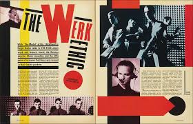
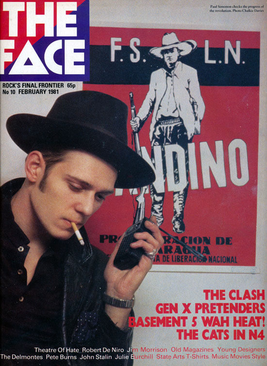
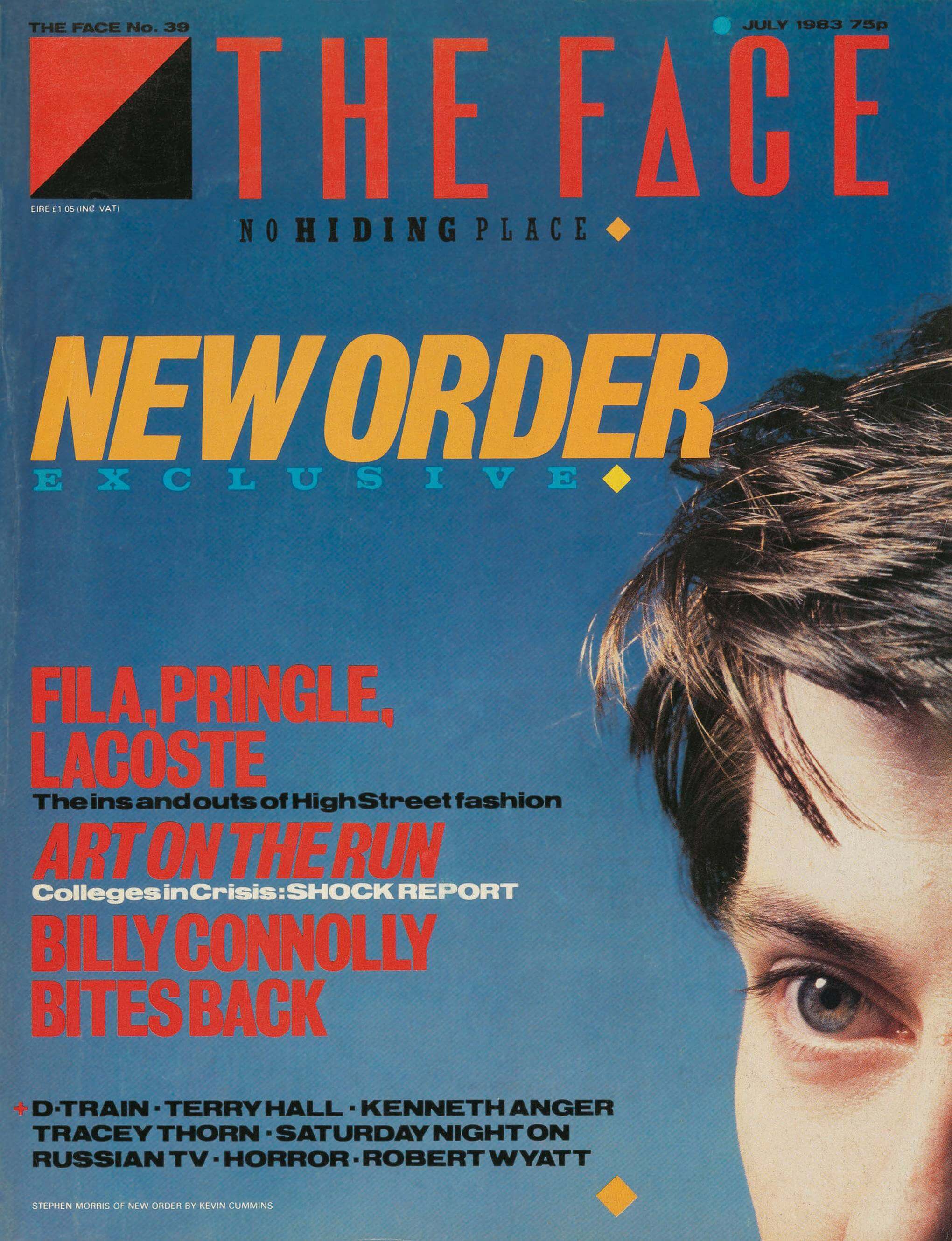
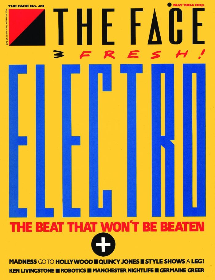
Every cover page of the magazine is unique, so the fonts and layout used can vary, although some recurrent features can be identified. Another postmodernist characteristic, the image appropriation, is expressed through the constant representation of a big face, usually, the face of an artist. The colourful image of the face is used as background and it occupies the entire space of the cover page. Consequently, the text wraps the image. On the other hand, the images than can be found inside the magazine sometimes are less brilliant or even monochromatic on the hues of grey, sepia or blue. Even in this case the image is usually big and tends to occupy most of the space available in that page, leaving a border below or on the side for the caption or a short text. In some cases images are put oblique on the page and so they can overlap. Photographs are layered with multiple combined geometric shapes The use of black, red and yellow thick margins responds to the need to reproduce this combination of pictures, lines and shapes.
figure {
  width: 80%;
  -webkit-column-span: all; /* Chrome, Safari, Opera */
  column-span: all;
  padding-left: 0;
  border-right: 20vw;
  border-left: 5vw;
  border-left-style: solid;
  border-left-color: #FBCC2D;
  overflow: hidden;
}

figure > figcaption {
  width: 30%;
  font-family: 'Helvetica Neue';
  font-size: 0.8rem;
  font-style: bold;
  float: right;
  padding: 5px;
  border-left: 1vw;
  border-left-style: solid;
  border-left-color: black;
}

figure > figcaption > em {
  font-family: 'Helvetica Neue';
  font-size: 1rem;
  font-style: bold;
}

figure > img {
  width: 80%;
  margin: 0;
  border-right: 6vw;
  padding-left: 10vw;
  border-right-style: solid;
  border-right-color: #D43D14;
  filter: grayscale(50%);
}
Simple and not.
Colour plays an important role in Brody’s work. The style of “The Face” is well-defined by the recurrence of few basic colours: red, blue, white, black, yellow. Red, black and white are the most common colours used on The Face magazine covers, sometimes also blue hues. However, their combination with geometric shapes and lines placed asymmetrically on the page enables to create vibrant images. Although basic shapes, elements and colours are used, the dramatic layout makes their use not so simple and the final result not traditional at all.
body {
  margin: 0;
  background-color: #F2D474
}

header > section {
  background-color: #4D7791;
  border: 0;
}

footer > p > a > em {
  font-family: 'Helvetica Rounded';
  font-size: 1rem;
  font-style: bold;
  color: #FBCC2D;
}
SOURCES
Archive Corriere della Sera www.archivio.corriere.it , 1980
History of graphic design, Neville Brody, www.historygraphicdesign.com
History of graphic design, The Face (magazine), www.historygraphicdesign.com
Wayne, Collins et al, Graphic Design and Print Production Fundamentals, Graphic Communications Open Textbook Collective, p. 25