Victorian Playbill attention-seeking design
Nineteenth-century industrialization led to a wide breadth of innovations. The commodification of cheap paper—combined with an abundance of products to buy— meant that advertising boomed like never before. Technological advances in lithographic printing and wooden type allowed manufacturers and advertisers to flood the market with bold and ornate announcements, advertisements, illustrations, documents, and product packaging. Consumerism was on the rise and ordinary people were gaining buying power. This meant that they could go to the theater too!
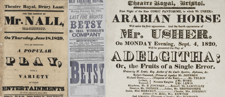
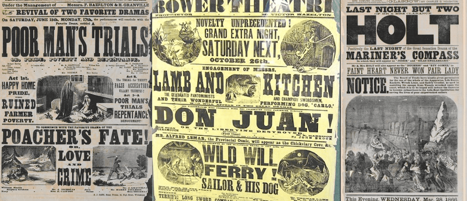
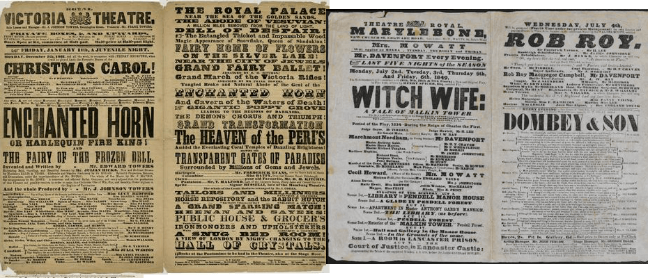
Victorian era playbills — theatrical posters — became cluttered, highly decorative, eclectic pieces. From the 1830s, the Victorian style of type and design was in, which mean that highly decorative and detailed imagery was slowly seeping into theatrical posters as well.
Key Characteristics
The main characteristics of this theme were:
Font Soup
Perhaps the most evident characteristic of Victorian playbills is the eclectic mix of typefaces and fonts present. Printers would buy typefaces in sets of display sizes and frequently wouldn’t own more than one or two sizes of a particular font. This explains the way the reader is overwhelmed with such a huge variety of type styles: it’s almost as if a different font were used for each size (Caplin 2012). Among these novelty faces were the first Fat faces, the first three-dimensional faces, the first Egyptian faces, the first sans-serif faces, and the emergence of woodcut shading (French 2014). On the whole, the Victorian age was a period of imitation and reproduction with many styles including gothic and rococo being revived, often with more than one style influencing a single piece of work (Flintriver 2016). In the theme design, 10 different typefaces of the aforementioned families were employed to transmit the spirit of the era.
The 10 open fonts were imported as local files:
/********BODONI********/
/* bodoni-bold */ /* USED IN: body; p */
@font-face {
    font-family: bodoni-bold;
    src: url("../../fonts/vp/BodoniFLF-Bold.ttf") format("opentype");
}

/********EGYPTIENNE********/
/* fette-egyptienne */ /* USED IN: header>p */
@font-face {
    font-family: fette-egyptienne;
    src: url("../../fonts/vp/Fette-Egyptienne.ttf") format("opentype");
}
/* toskanische-egyptienneInitialen */ /* NO NUMBERS*/
@font-face {
    font-family: toskanische-egyptienneInitialen;
    src: url("../../fonts/vp/ToskanischeEgyptienneInitialen.ttf") format("opentype");
}
/* plastische-plakat-antiqua */ /* USED IN: h2; a:hover */
@font-face {
    font-family: plastische-plakat-antiqua;
    src: url("../../fonts/vp/Plastische-Plakat-Antiqua.ttf") format("opentype");
}

/********SLAB SERIF********/
/* klein-slabserif */ /* USED IN: p>em; a */
@font-face {
    font-family: klein-slabserif;
    src: url("../../fonts/vp/Klein-Slabserif.ttf") format("opentype");
}

/********SEMPLICITA********/
/* semplicita-medium */
@font-face {
    font-family: semplicita-medium;
    src: url("../../fonts/vp/Semplicita-Medium.otf") format("opentype");
}
/* semplicita-ombra */ /* USED IN: header>section>p; h4 */
@font-face {
    font-family: semplicita-ombra;
    src: url("../../fonts/vp/Semplicita-Ombra.otf") format("opentype");
}

/********OTHER********/
/* vineta-regular */ /* USED IN: h1; q */
@font-face {
    font-family: vineta-regular;
    src: url("../../fonts/vp/Vineta-Regular.ttf") format("opentype");
}
/* woodcut */ /* USED IN: header>p>a */
@font-face {
    font-family: woodcut;
    src: url("../../fonts/vp/Woodcut.ttf") format("opentype");
}
/* jfringmaster */ /* USED IN: h3 */
@font-face {
    font-family: jfringmaster;
    src: url("../../fonts/vp/JFRingmaster.ttf") format("opentype");
}
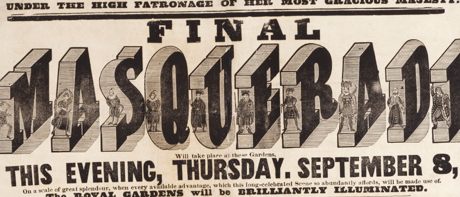

Attention Seeking
The main idea behind using many different kinds of typefaces was to gain the attention of the passerby. In this sense, it was very important for certain parts of the text to be attention grabbing, mostly through the choice of bold, three-dimensional and Egyptian fonts or through other effects.
In 1810, Bower, Bacon and Bower of Shefflield issued the first Fat faces, exaggeratedly heavy typefaces that were intended for display, but some were barely legible even for display purposes (Carter 2014). Bodoni Poster is a digital typeface that is closely based on an early Fat face design — and is the one applied to the main body of the CSS theme. Three-dimensional typefaces were first introduced as a novelty in 1815. Advertisers quickly picked up on the idea, and soon there was an abundance of three dimensional typefaces being used in ads. The h1 titles in the theme use one of these. Egyptian faces — distinctively squared, slab-like serifs with low contrast between their thick and thin letter parts — were also typical of the style and are used in the CSS theme for the other titles and emphases. ~“Egyptian” as a name may been selected to draw a reference to the blocky horizontal look of Egyptian hieroglyphics that were in the public eye at the time, due to the recent excavation of the Rosetta Stone by Napoleon’s troops.~
Other effects were implemented in the CSS theme to transmit the attention seeking aspect of the playbills, such as hover effects over certain titles, images, and links. Furthermore, for emphasized elements, links, and quotes other effects, such as increasing the font size relative to the rest of the paragraph, a bright red color, or changing the font style were implemented.
A hover “attention” effect was implemented on figures, the title of the article and any links as follows:
h2:hover {
  font-size: 12vw;
}

header > p > a:hover {
  font-family: "woodcut";
  font-size: 5.2vw;
  color: black;
}

body > figure img:hover {
  transform: scale(1.1);
}
Emphasis for emphasis elements, links, and quotes was done by increasing the font size, relative to the rest of the font-size of the rest of the paragraph (2vw):
p > em {
  font-family: "klein-slabserif";
  font-size: 4vw; /* no italics */
  font-style: normal;
  text-transform: uppercase;
}

a {
  font-family: "klein-slabserif";
  font-size: 3vw;
  text-transform: uppercase;
  text-decoration: none; /* take out the automatic underlining */
  color: red;
}

a:hover {
  font-family: "plastische-plakat-antiqua";
  font-size: 5vw;
}


q {
  font-family: "vineta-regular";
  font-size: 3.5vw;
  text-align: justify;
}
Viewport Sized Typography was used (except for some values in small screen media query), as it allows tight coupling of size relationships.
Images & Decoration
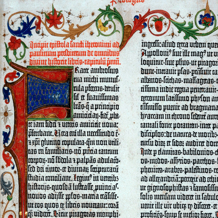
In 1822 the first photographic image was created by Joseph Niepce of France, paving the way for photolithographic and phototypesetting processes to come. While most playbills were mostly text, some of them included lithographs or later even black and white or sepia photographs. Additionally, the trend was for images to be either contained in circles or to have rounded corners (see historical Playbills Don Juan and Mariner's Compass). This is why the images that are kept in the theme have a sepia filter and rounded corners. The decorations that flank both sides of the figures are inspired by the trend of Victorian decorations. To Victorians, these abundant decorations represented the comforts that were newly available to the burgeoning middle class. Playbill figures and titles could sometimes sport frame and decorative elements (French 2014), and Victorian-style design dictated that images may have ornamentation coming out of their circled frames. Finally, Playbills tended to be on paper that was stamped on outside walls, so they tended to get stained. This is why the background has a brownish, slightly mottled tint (Caplin 2012).
The sepia filter was applied to images and (potentially) to videos as follows:
figure > img {
  width: 50%;
  margin: 0;
  padding: 0;
  border-radius: 40%;
  filter: sepia();
}

figure > video {
  width: 50%;
  margin: 0;
  padding: 0;
  border-radius: 40%;
  filter: sepia();
}
Victorian style decorations were added to section titles and images. The decoration of the first figure of the article was deliberately chosen to be different from the rest of the figures, and from the section title decorations:
  h4 {
   background-image: url("../../img/bg/playbill/decleft0.png"), url("../../img/bg/playbill/decright0.png");
   background-repeat: no-repeat;
   background-position: left, right;
   background-size: 10%;
 }

 body > figure {
   background-image: url("../../img/bg/playbill/decleft1.png"), url("../../img/bg/playbill/decright1.png");
   background-repeat: no-repeat;
   background-position: left, right;
   background-size: 25%;
 }

 figure {
   background-image: url("../../img/bg/playbill/decleft.png"), url("../../img/bg/playbill/decright.png");
   background-repeat: no-repeat;
   background-position: left top, right top;
   background-size: 25%;
 }
A decision was made to make figures that are not part of the main article itself (such as logos, etc) caption-less, and to give them a maximum height in order to keep the main headers in the initial viewport:
body > figure figcaption {
  display: none;
}

body > figure img {
  width: 50%; /* use percentage of the figure box width */
  border-radius: 10%;
  max-height: 70vh;
  transition: all .2s ease-in-out;
  float: none;
}
The paper background image was imported as follows:
html {
  background-image: url("../../img/bg/playbill/papersmall.png");
  background-repeat: repeat;
  height: 100vh;
  width: 100vw;
  align-items: center;
}

Long & Justified
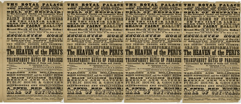
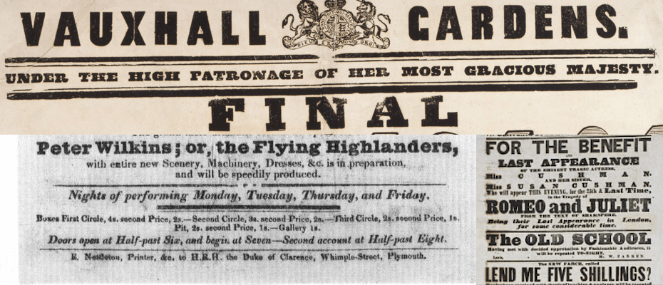
Victorian playbills were designed to fill the entire page with images and type, as readability was not the first priority. To fit in available space, text was justified to fit the full width of the space (excluding side margins, which are present in most payrolls with a ratio of around 10% of the width), and liberties were taken with the design leading many times to visual clutter (Caplin 2012). This led to centered, justified eclectic compositions. In the theme, all the body text is centered and justified to fill up as much of the space as possible. The playbills also tended to be thin and long documents, which for the CSS theme was implemented with an infinite scroll type of navigation.
Many of the header fonts were text-transformed to uppercase and justified with extra inter-character spacing, for example:
header > p {
  font-family: "fette-egyptienne";
  font-size: 2.7vw;
  font-weight: 500;
  text-align: center;
  text-transform: uppercase;
  text-justify: inter-character;
  letter-spacing: 1.5vw;

  margin-top: 1vh;
  padding-top: 2vh;

  margin-bottom: 1vh;
  padding-bottom: 1vh;
  border-bottom: 0.3vh solid black;
}
The style requires an infinite scroll type of interaction, implemented through a full width for the whole document:
body {
  height: 100vh;
}
The margins of the whole document were created with:
body {
  height: 100vh; /* the style requires an infinite scroll type of interaction, as the original docs were very long*/
  padding-left: 10%;
  padding-right: 10%;
  text-align: center;
}

Borders and Leader Dots
The cluttered and eclectic design of playbills tended to be somewhat stabilized by horizontal borders from section to section or even title to title. The style of the borders was varied, but double and thick black borders were most common. These were implemented in the CSS theme independently for each type of element, to maintain the relative eclecticness of the style. The bottom border of the last paragraphs and figures of each section were not displayed.
As playbills are theatrical posters, most of them contain cast lists and tables. These were characterized by “leader dots”. Table styling was inspired by this aspect of the playbills— this is why the internal borders of the tables are dotted, and the external ones are dashed.
The borders were added to elements separately:
h1 {
  border-bottom: 0.5vh dotted black;
}

h2 {
  border-bottom: 1vh dotted black;
}

h3 {
  border-bottom: 0.5vh dotted black;
}

section {
  border-top: 3vh double black;
}

p {
  margin-top: 1vh;
  padding-top: 0vh;

  margin-bottom: 1vh;
  padding-bottom: 1vh;
  border-bottom: 0.7vh double black; /* all paragraphs except the last one (see above) have a bottom border*/
}
The bottom border of the last paragraph and figure of each section was not displayed:
p:last-child {
  border-bottom: none; /* because sections have upper borders, erase the bottom border of the last paragraph of a section or body*/
}

figure:last-child {
  border-bottom: none; /* because sections have upper borders, erase the bottom border of the last figure of a section or body*/
}
The dotted and dashed borders of the tables were implemented as follows:
section > figure > table {
   width: 100%;
   table-layout: fixed;
   font-family: "semplicita-medium";
   font-size: 2vw;
   border: 4px dashed black;
   border-collapse: collapse;
}

section > figure > table  td {
   border: 2px dotted black;
}
Carter, Hodgkin. “History of Type.” Carter Hodgkin Design, 2014, www.carterhodgkindesign.com/BMCC/Typography/HistoryOfTypography.pdf.
French, Nigel. 2014. Designing a Typographic Victorian Ad. https://www.lynda.com/Illustrator-tutorials/Type-Project-Victorian-Ad/155652-2.html.
“Graphic Design History – The Victorian Era.” Flintriver, 17 June 2016, www.flintriver.co.uk/graphic-design-history-the-victorian-era/.