Gutenberg Everything old is new again
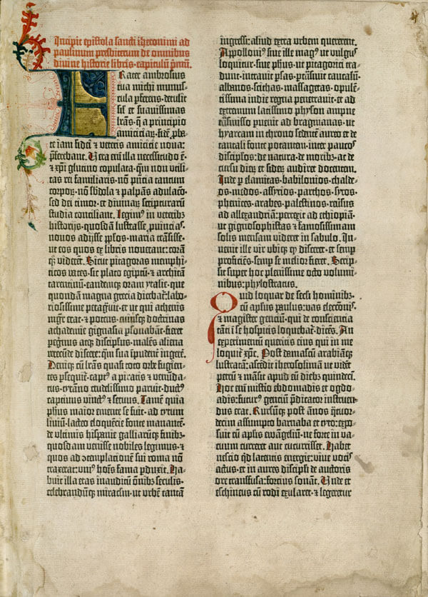
Gutenberg is known as the man who invented a method of printing by using moveable type. His greatest printing achievement, besides being the first book ever to be printed by moveable print in the West, was the Gutenberg Bible, a two-volume copy of Jerome’s Latin Vulgate. It was 1454. Gutenberg and his work stand on the threshold between the end of the handwritten manuscript tradition and the rise of the print tradition in the West. In 2001 the Gutenberg Bible has been included by UNESCO in its program “Memory of the world”.
The first editions that were printed between the mid of 1400 and the year 1500 by using the method of the moveable type were called incunabula or “quattrocentina”. Since the print tradition was at its very beginning, incunabula were still marked by the heavy influence of manuscripts in the visual organization of the page, in the relation between text and blank space, and in the use of precious decorations that gradually disappeared in the later print editions. This is the reason why the design of this theme tries to mix some of the typical features of the manuscript tradition in the Western world with the most characteristic elements of the first printed editions, mainly extracted from Gutenberg’s masterpiece.
Key Characteristics
The main characteristics of this theme were:
Medieval manuscript influence in the layout
Here there is a list of the elements that reveal the persistence of the manuscript tradition but which are also signals that things are changing:
- bordering: asymmetric organization of the text on the page, symmetric organization of the text on the spread. See Golden Ratio below.
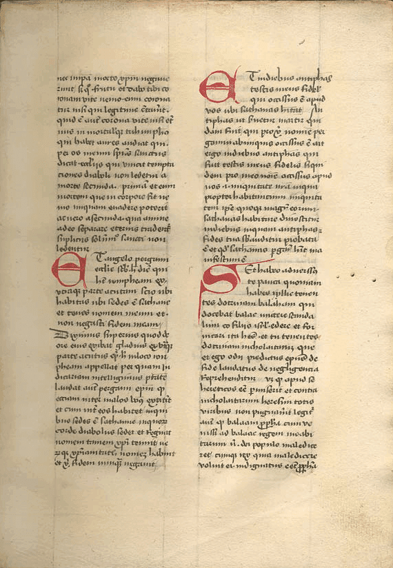
- disposition of the text: medieval manuscripts were printed on a single sheet, not on both sides of a page, while incunabula used both the sides of every page, like Gutenberg in his Bible. Text in manuscripts was usually set in one justified column per page, while the first printed booked, like Gutenberg’s Bible, usually organized text in two columns per page.
- Justified setting: printed layouts differed from manuscripts in the justified setting.
p {
  font-family: '1454 Gutenberg Bibel';
  font-size: 1rem;
  font-style: normal;
  column-count: 2;
  column-gap: 4vw;
  text-align: justify;
}
Precious details
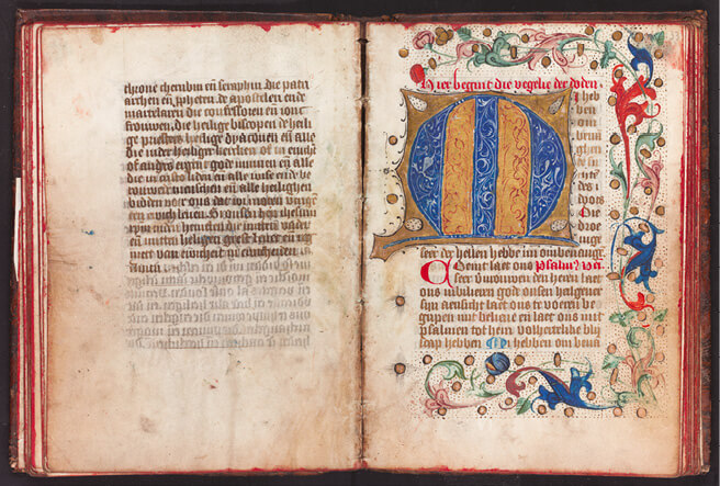
Following the design of manuscripts, printers of incunabula also had the initial of the first word of each chapter in large size and mainly red ink, then other colours were used for the illumination. For the Gutenberg theme the colour blue ultramarine has been used to give an idea of the variety of colours. In the process of printing the illumination, the corresponding part of the page for the initial was left blank, and later decorated by a specialist called "rubricator". To designate the letter to be drawn, a small form of the letter ("guide letter") was sometimes printed in the space beforehand. Other typical decorations of manuscripts, including border decorations and pictorially represented initials, were also used in incunabula.
  figure:after {
  content: "";
  display: inline-block;
  background-image: url("../../img/divider/decoration.png");
  background-repeat: no-repeat;
  background-position: center;
  background-size: 120%;
  width: 100%;
  padding-top: 30%;
}
Pigments
The predominant colour in incunabula was black, used for the text, marking the thick border of tables and images. However, red vermilion was also very commonly used for the text, particularly to mark the initial few lines of the page and some other text external from the main body. Red was also used for the illuminations around the capital letters and decorations around the text, where some other colours were used like blue ultramarine, yellow orpiment and saffron yellow, a green hue obtained from malachite and lead white (biacca) sometimes.
p::first-letter {
  font-family: 'Medieval Scribish';
  font-size: 4rem;
  color: #120A8F;
}
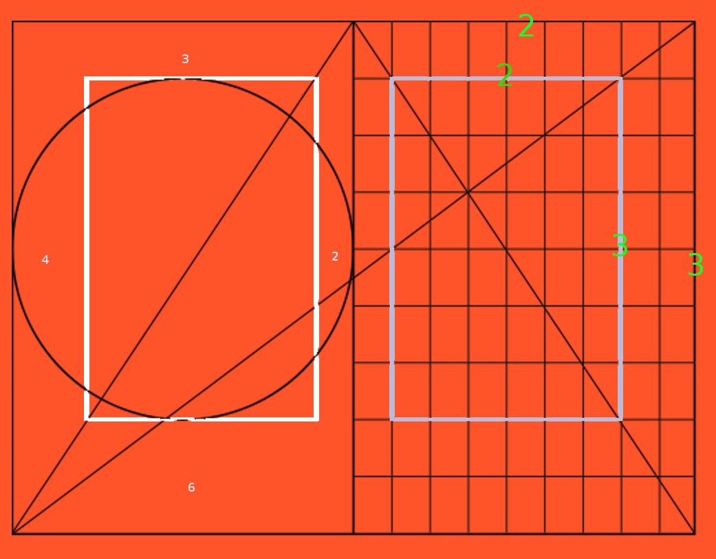
The Golden Ratio
The main reference for the mathematical proportions of the spaces in the page was the golden ratio. Apparently, Gutenberg applied the golden canon of page construction to his work. Gutenberg Bible's page was based on the golden section shape, based on the irrational number 0.618... (a ratio of 5:8). The printed area in the page also had that shape. The striking balanced composition of Gutenberg's bible would have resulted from the application of the Golden rule geometry.
html {
  background-image: url("../../img/bg/nSydVZm.png");
  background-size: cover;
  width: 100vw;
  height: 100vh;
}

body {
  margin-top: 10vh;
  margin-right: 40vh;
  margin-left: 20vh;
  margin-bottom: 40vh;
}
Gothic and Roman types
In medieval Europe, different scripts were used in manuscripts depending on the type of books or documents or on when and where the transcription was performed. For this reason, the printers of incunabula used various typefaces depending on the manuscript based on which they made books.
Gothic scripts included "textura quadrata" and "rotunda". The first one, which was used to print the 42-line Bible, was originated in northern France around the 11th century. Characterized by sharp-cornered letters, in the period of Gutenberg it was widely used for Bibles, liturgies and other books. The second one, sharp-cornered yet but slightly more rounded, was created in Bologna in the 12th century but was used until the 15th century.
Until these "Gothic" scripts appeared, the elegant script "Carolingian minuscule" had spread throughout Europe, thanks to its easy-to-read letters and punctuation methods. It was used to transcribe Ancient Roman classics. The "Carolingian minuscule" script is closer to those used in ancient Rome than the Gothic script; therefore, humanists in the 15th century attempted to revive it as a symbol of return to classical styles of ancient times, and so the "Roman type" was born.
Gothic and Roman were two major types used for incunabula, while italic type came into use in the 16th century. Gothic type accounts for 80% of all the types used in incunabula. Roman type, meanwhile, accounts for 20% of all the types used in incunabula. The use of different fonts is meant to reflect the ‘hybrid’ style of incunabula and to represent the fact that despite the tendency to keep all the letters similar, slightly different dimensions in height and width of the text could occur.
@font-face {
  font-family: '1454 Gutenberg Bibel';
  font-style: normal;
  font-weight: normal;
  src: local('1454-Gutenberg-Bibel'), url("../../fonts/first_printed_books/1454-Gutenberg-Bibel.otf") format('otf');
}

@font-face {
  font-family: 'Carolingia';
  font-style: normal;
  font-weight: normal;
  src: local('carolingia'), url("../../fonts/first_printed_books/carolingia.otf") format('otf');
}

@font-face {
  font-family: 'Medieval Scribish';
  font-style: normal;
  font-weight: normal;
  src: local('scribish'), url("../../fonts/first_printed_books/scribish.otf") format('otf');
}
SOURCES
Archart, Scrittura dei manoscritti medievali, www.archart.it
Brewminate, online website brewminate.com
Dawn of Western Printing. Incunabola. Exhibition based on the following book: Inkyunabura no Sekai (The World of Incunabula) / written by Hiroharu Orita, compiled by the Library Research Institute of the National Diet Library. Tokyo: Japan Library Association, July 2000 - www.ndl.go.jp
Novin, Guity, A History of Graphic Design http://guity-novin.blogspot.com
Wegner, Paul D., The Journey from Texts to Translations: The Origin and Development of the Bible, Baker Academic, 2004.